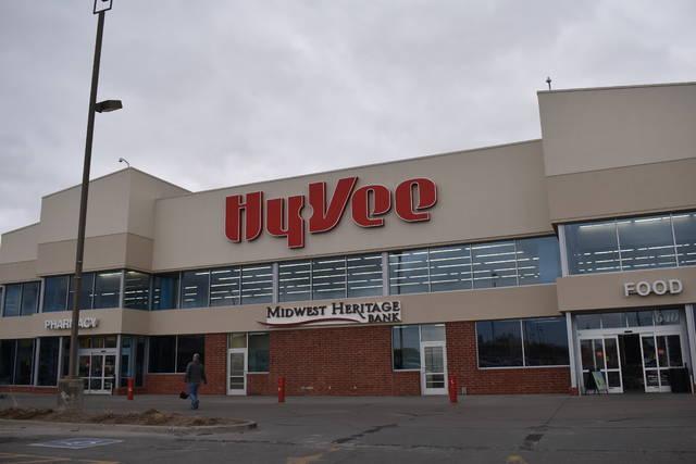
The brand and experiential graphic design
at Hyvee Ames, Iowa.
Abstract
This paper analyzes the brand and experiential graphic design of the Hyvee which is located at west of Ames, Iowa. The main proposition is that how the brand and experiential graphic design deliver the meaning from space to customers. This study is started with visual language theories which came from Visual Culture (Howells, Richard. 2003) and Ways of Seeing (Berger, John. 1972). In order to prove the visual language theories such as iconology, form, ideology, and semiotics, I’ve observed visual elements in the store. I analyzed these elements as denotation and connotation levels.
Keywords: Brand; Experiential graphic design; retail store experience; visual theories
Introduction
In Ways of Seeing (Berger, John. 1972), John explains about how the oil painting influence to publicity images as a metaphor or a reproduction. He introduces the way of seeing the publicity images as well as the fine arts. Also, he explains that how the fine arts, especially oil paintings, are reproduced as publicity images. In the book, Visual Culture (Howells, Richard. 2003), the author explains about some theories related to fine arts. Iconology is that how visually to represent abstract ideas (Richard, p22), form is a kind of vehicle to deliver the meaning of arts (Richard, p35). Ideology is simply the study of ideas, systems of thought and systems of belief (Richard, p84). Semiotics related to how a visual word communicate of meaning with people (Richard, p112). Hermeneutics is an interpretative approach that acknowledges the potential differences between literal and intended meaning (Richard, p137). To verify these all theories above, I selected a Hyvee store at west of Ames, Iowa, and I investigate all visual languages in store.
Analysis of entrance
At an entrance of the Hyvee, you can see the pictures of cofounders and the first Hyvee store with some texts of their history. Cofounders’ pictures are black and white, and similar with traditional portrait paintings, they are staring forward and look like very proud themselves. Two cofounders’ picture and the first store picture would connote their pride of history, heritage, and belief. The Hyvee uses black & white pictures to connote these as a form of history panel.

Analysis of section signs
In store, there are a lot of different signage types. They convey the information of the product, section and promotions such as price, name of products, and origins. Section signs use water color illustration with section name, and typography. These signs denote color, name, font, product those customers could get at this section. As connotation level, it would mean the fresh food, friendly environment, emotional approaches. To connote these things, they use water color painting as a form of their sign.

Analysis of price tag
For price tag, Hyvee uses some color codes those have specific meaning. Red color means low price or price is discounted if customers have fuel save card. Yellow color means price decline, and it means this decline is temporary. Green color means fresh products such as fruits and vegetables. Hyvee uses color codes as iconology and semiotics.

Analysis of special section for healthy food
In store, there is a special food section, Health Market. Hyvee sells natural and organic food at this section. To make differentiate with any other sections, this section uses a little bit different visual language such as more natural fabrics and hand drawings, but uses same typeface for the name of section. This section denotes different style, foods, and fabrics, but a part of store by same typeface for name of section. It connotes organic, healthy, natural, and fresh. It uses hand drawings as a form, iconology and semiotic.

Analysis of atmosphere
The music is playing not loud but low volume, so it’s not difficult to talk with another person. There are enough lights, so the store is bright enough and it make me comfortable and to feel this place is clean and clear. Therefore, the atmosphere of store looks like more luxury than others because of classical music and lot of fresh food sections with good quality.

Conclusion
As we’ve learnt from Ways of Seeing (Berger, John. 1972), and Visual Culture (Howells, Richard. 2003), visuals convey a lot of meanings and they evoke personal emotion in space. It’s not easy to define as each visual theory for common person. But we, as designer, have to consider how the visual words would work at store and how it communication with customers.
References:
- Howells, Richard. Visual Culture / Richard Howells. Cambridge, UK: Malden, MA: Polity; Blackwell, 2003. Print.
- Berger, John. Ways of Seeing: Based On the BBC Television Series With John S Berger. London: British Broadcasting Corporation and Penguin Books, 1972.